Managing Your Themes
Editing
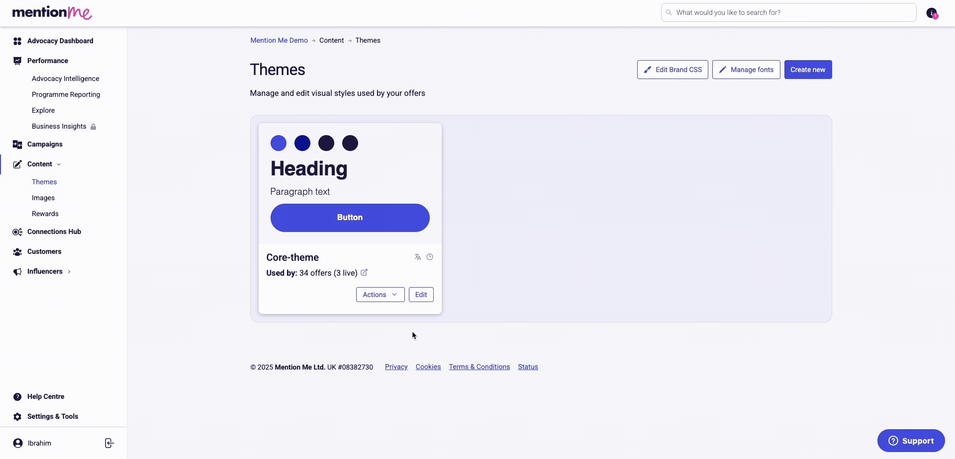
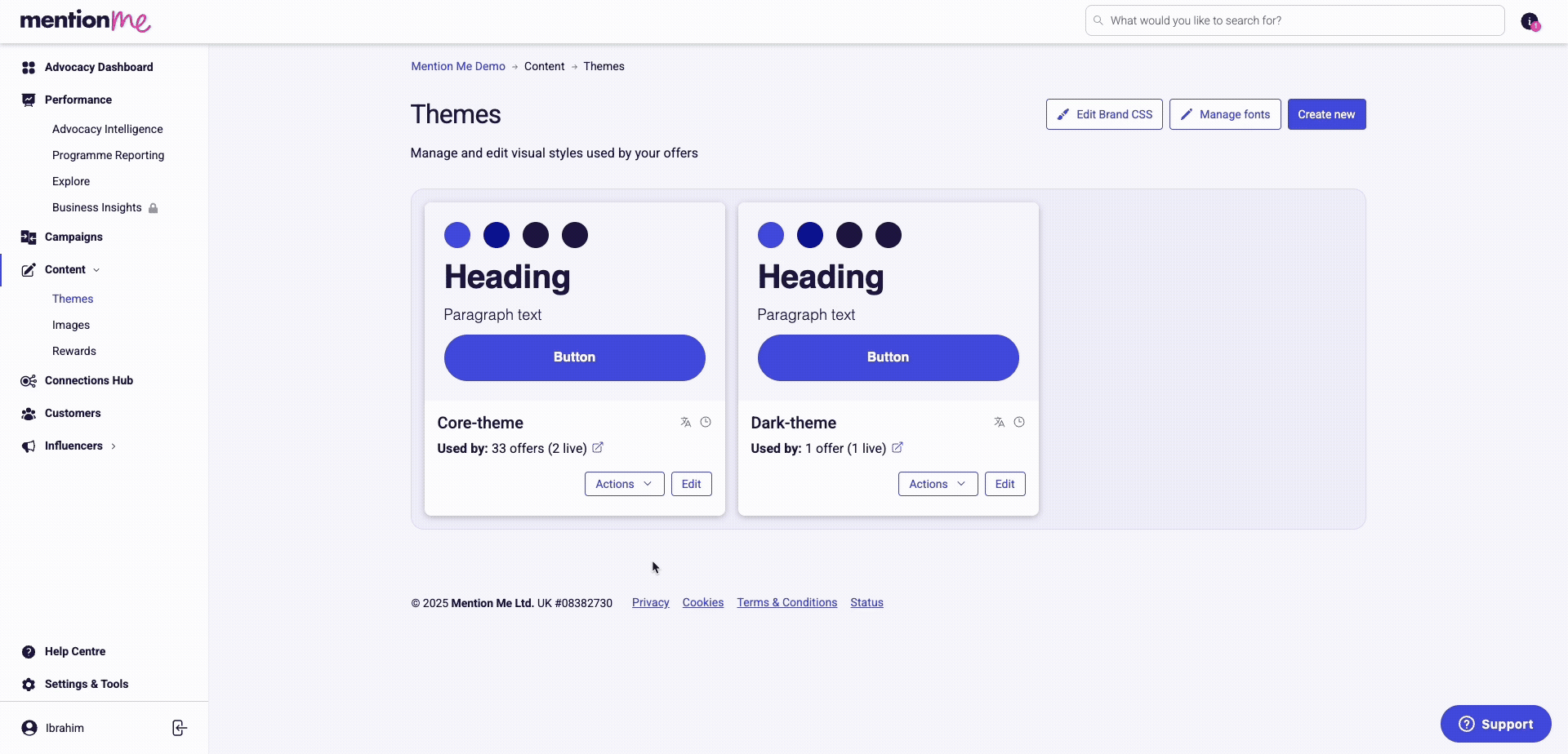
To change the way your offers look, click Edit on the theme you want to change. This opens the theme editor where you can customise and preview changes in real time.
Renaming
- Click Actions on the theme you want to rename.
- Select Rename, enter the new name, and confirm by clicking Rename.
Duplicating
Click Actions and select Duplicate. This creates a new theme that looks exactly like the original — it will not be assigned to any offers by default.
You can also make changes to a theme in edit mode and view them without making them live. Your progress will be saved.
Assigning Themes to Offers
You can assign your theme to multiple offers at once:
- Click Actions on the theme you want to assign.
- Using the filter toolbar, select Campaign, Campaign status, or Experiment status to filter by. Click the checkbox on the offer or offers you want the theme applied to.
- Click Assign in the bottom right to confirm.
You can also view the offers using a theme via Show offers using theme under Actions.
Theme Editor
Edit Controls
Edit mode — Must be switched on to make any edits. All edits are autosaved but not put live. If you close the page and return, toggle edit mode back on to see your edits.
Publish — Clicking Publish pushes your changes live across all offers linked to the theme.
Touchpoint Navigation
Depending on which offer you’re previewing, the navigation adjusts to show the touchpoints in use. Click the touchpoint you want to edit and the styling controls will update accordingly.
Preview Controls
Preview Offers
Choose which offer to show in the theme editor. The theme must be assigned to the offer for it to appear here.
Screen Filters
Choose between Key screens or All screens to display your designs on. You can further refine by choosing between Referrer or Referee screens.
Switching to Comment mode allows you to click anywhere on the screens and leave a comment — to request an amend from your design team or leave a note for a colleague. Switching back to View mode hides the comments.
Device Views
Preview the touchpoint in mobile or desktop view. You can leave comments separately on mobile or desktop for more specific feedback.
Styling Controls
Not all settings are the same for each touchpoint — some are unique to specific touchpoints. Some touchpoints have reduced styling options as they inherit the screen styling for consistency.
The email touchpoint has no styling controls. Email styling must be done via custom CSS — we recommend requesting the Mention Me design team to style this for you.
Page and Layout Styling
Controls the main container or iframe of the selected touchpoint. This most commonly includes background colour styling and master controls which cascade across the touchpoint.
Text Styling
Style headings, body copy, and terms and conditions. Where appropriate, you can differentiate between mobile and desktop settings. Terms and conditions inherits most styling and therefore has limited settings.
Link Styling
By default, all links are underlined and in a contrasting colour to adhere to accessibility criteria. This can be adjusted to suit your design system.
All buttons for the touchpoint can be styled here. Switch between button types with the tab menu at the top. Different button states can be styled, and you can adjust how the button width sits in the touchpoint.
Basic input field styling to match the default state of any brand.
Custom CSS
For further customisation, you can add or edit CSS for all touchpoints on separate stylesheets. We recommend only editing this if you are competent in CSS and LESS CSS, as custom CSS can potentially break parts of your journey.