Path 1: Use the Programme Success template
The Programme Success Dashboard template already includes campaign breakdowns.- New dashboard → Browse templates → Programme Success Dashboard.
- Scroll to the breakdown tables. They show revenue and new customer numbers per campaign.
Path 2: Build it yourself
If you want a focused campaign-comparison dashboard and nothing else, build two tiles.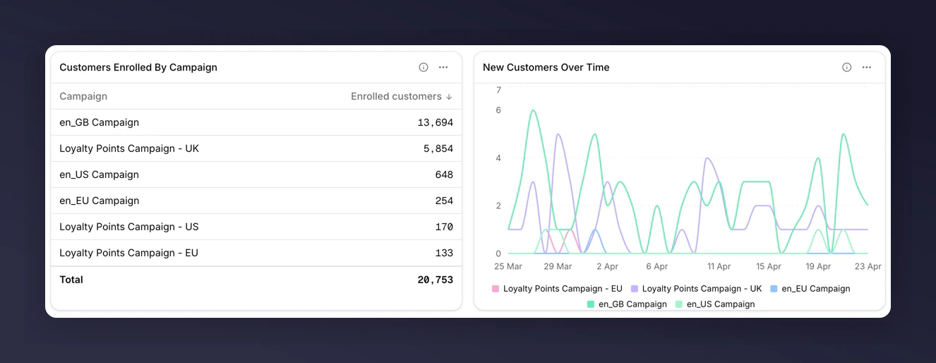
1. Table with key metrics, split by Campaign
- Add tile → Table.
- Add metrics: New Customers, Total Referral Revenue, Share Rate.
- Set Breakdown to Campaign.
- Save.
2. Line chart of revenue over time, split by Campaign
- Add tile → Chart.
- Keep chart subtype as Line.
- Add metric: New Customer Revenue.
- Set Breakdown to Campaign.
- Save.
What to look for
- Outliers in the table. A campaign with unusually high Share Rate but low New Customers may have strong top-of-funnel but a weak incentive.
- Crossover in the chart. A rising campaign overtaking a falling one is usually the most actionable signal.
- Small campaigns in “Other”. The long tail collapses into an “Other” bucket. Export the tile’s CSV to see the raw rows behind it.
Next
- Breakdowns for how top-N and the “Other” bucket work.
- Comparisons to add a vs-last-period number to each campaign (note: requires a second tile per metric, because breakdown and compare are mutually exclusive on one tile).