

- Big number → Metric
- Trend or comparison → Chart
- Exact rows → Table
- Commentary → Markdown
Metric
A single number, large and legible. Use when the answer is one figure: “how many new customers this week” or “what’s our share rate.” Supports an optional comparison, which renders a delta badge (“+12.3%”) next to the value.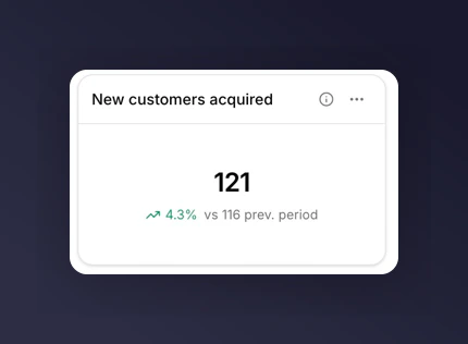
Metric tile with a comparison delta
Chart
Up to six metrics plotted across time or split by a breakdown. Pick the chart subtype that fits the question. See choosing a chart for the full decision guide. The five chart subtypes are line, bar, stacked bar, funnel, and share. Each has its own constraints around breakdowns and comparisons. See chart types.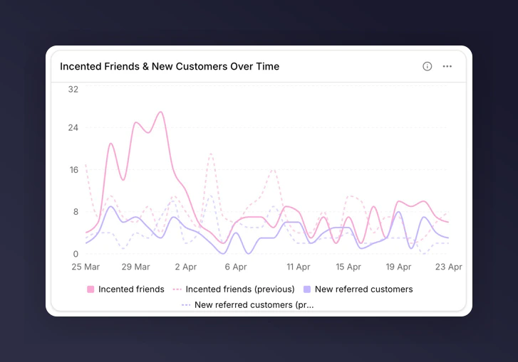
Line chart with a dashed compare line
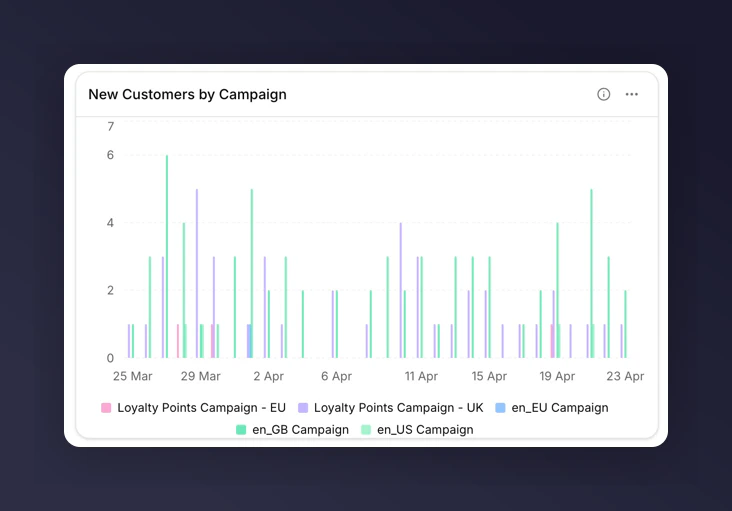
Bar chart broken down by a dimension
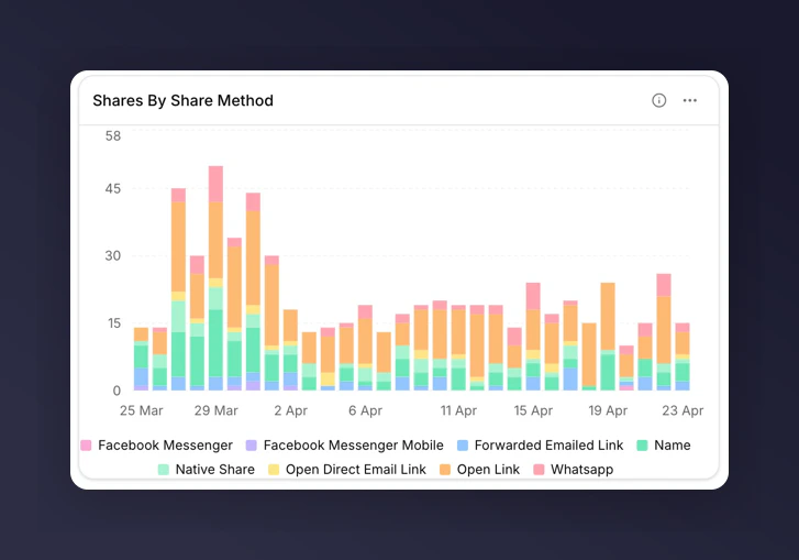
Stacked bar showing composition over time
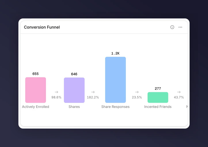
Funnel chart showing drop-off across steps
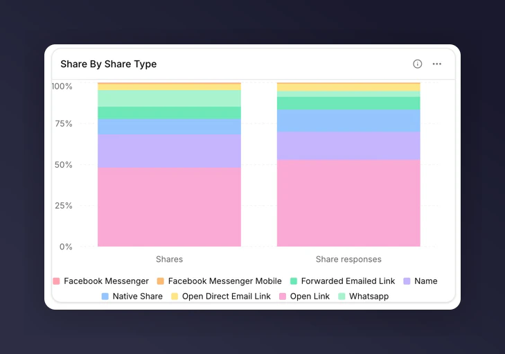
Share chart showing each segment's proportion
Table
Rows of exact values across up to six metrics. Add a breakdown to make each row a value of that breakdown (e.g. one row per Campaign). Use tables when stakeholders want the raw numbers, or when you need to export to a spreadsheet.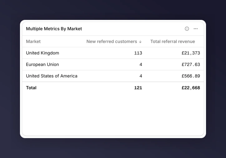
Table broken down by Market
Markdown
Free text rendered on the grid. Use markdown tiles for section headers, commentary, context, or links to related dashboards. Markdown tiles are the one tile type with no data behind them, so they cannot be exported. They also ignore filters and time periods.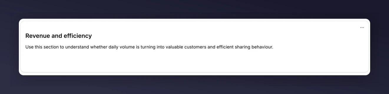
Markdown tile used as a section header
Next
Choosing a chart
Which of the five chart types fits the question you’re asking.
Breakdowns
Split a metric by campaign, market, or any other dimension.
Export data
Get the numbers out into a spreadsheet.