Decision guide
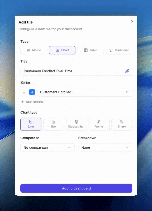
”How has this changed over time?”
Line. A continuous line plots a smooth trend across the period.”How do these periods compare side by side?”
Bar. One bar per period makes discrete comparisons easy.”How is this total made up, and is that shifting?”
Stacked bar. Segments within each bar reveal composition. Typically paired with a breakdown or multiple metrics.”Where are we losing people in the funnel?”
Funnel. Order metrics from widest to narrowest (e.g. Impressions → Sharers → Share Responses → Incented Friends → New Customers). Each step shows drop-off from the previous.”What’s the mix or proportion?”
Share. A pie-style view of segments. Segments come from a breakdown or from multiple metrics. Use when the total isn’t what matters, only the split.Three rules to remember
- Share, funnel, and stacked bar cannot compare. If you want compare-to, switch to line or bar.
- Breakdown and compare-to are mutually exclusive. Adding a breakdown clears any comparison, and vice versa. If you need both in one view, use two tiles.
- All metrics on one chart must share the same unit. You can’t put a currency metric next to a count metric on the same axis.
Tips
- Default to line. It supports breakdowns and comparisons, has no constraints, and works for almost every time-series question. Switch only when you have a specific reason.
- Use funnel for anything sequential where each step is a subset of the previous.
- Reach for stacked bar when the story is “the mix is changing” and for share when the story is “look at the mix right now.”
- If you find yourself asking “am I using the right chart”, switch it and see. Changing chart type doesn’t destroy metric or breakdown choices (as long as the new chart supports them).
Next
- Chart types for full technical descriptions.
- Breakdowns for how splits work.
- Comparisons for compare-to options.