

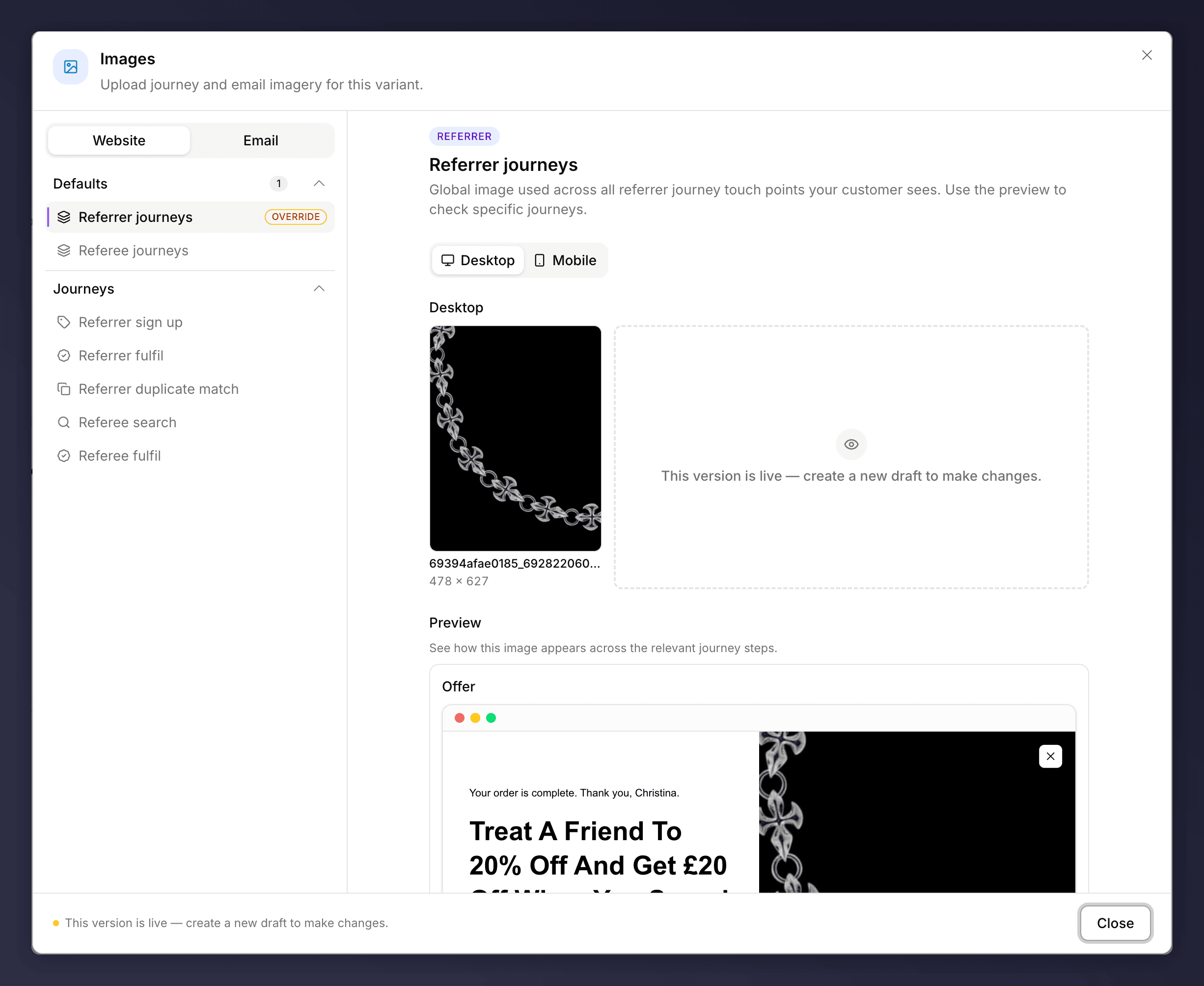
The Images section, with a default image and per-step overrides.
How It’s Organised
- Website and Email imagery are managed on separate tabs.
- Set a default image used across all referrer or referee touch points, or override individual steps (sign up, fulfilment, matching, search).
- Provide separate desktop and mobile assets, and use the preview to check how an image looks across the journey.
Choosing Imagery
Pick a style that suits your brand and keeps the offer readable:- Simple. A clean or solid-colour background makes overlaid text easy to read.
- Product. Put the product in focus and make it look desirable.
- Social. Hint at sharing and friendship (two people, two coffees).
- Emotional. Faces and positive expressions draw people in.
- Illustrated. Brand illustrations work well where typography carries the message.
The Images section can be A/B tested, for example lifestyle versus product imagery. See set up an A/B test.