

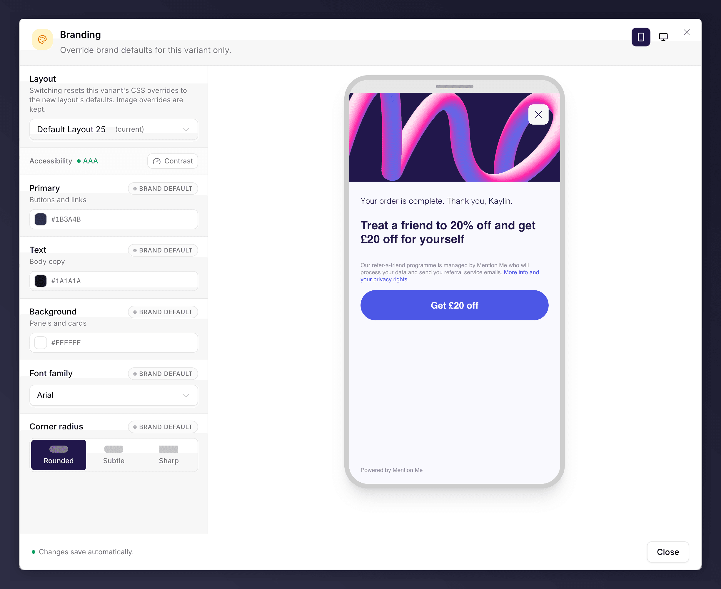
The Branding section, with colour and font controls.
What You Can Set
- Primary colour. Buttons and links.
- Text and background colours.
- Font family.
- Corner radius: Rounded, Subtle or Sharp.
Make It Feel Like Your Site
Customers refer more when the journey looks like a natural part of your brand. A few principles help:- Match your site. Use the same colours, fonts and button styling as your website so the journey is indistinguishable from it.
- Make the call to action obvious. The main button should be bold and the most prominent element on every screen, in a colour that contrasts with the rest of the page.
- Lead with the offer. The reward should be the first thing a customer sees and graspable in a second or two.
Fonts
Custom fonts apply to website screens only. Emails fall back to web-safe fonts (such as Arial, Georgia or Times New Roman), because a custom font may not be installed in the recipient’s email client.The Mention Me logo cannot be removed from the journey. It is required for data-protection transparency, and customers convert better when they can see the programme is a genuine part of your brand.
The Branding section can be A/B tested. See set up an A/B test.