

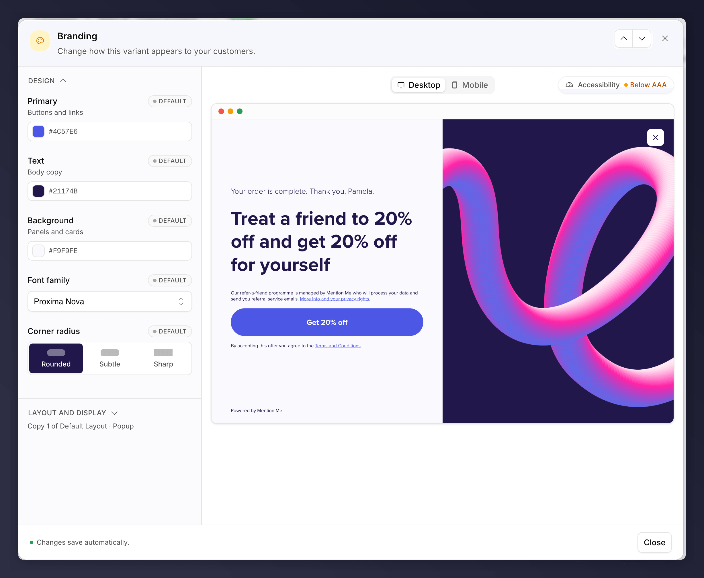
The Branding node, with the preview beside the Design and Layout and display sections.
Design
- Primary colour. Buttons and links.
- Text colour and Background.
- Font family.
- Corner radius: Rounded, Subtle or Sharp.
Layout and Display
- Theme. Switch between the offer layouts set up for your account. The control only appears when you have more than one theme to switch to.
- Offer display. How the offer first appears when the tag fires.
Offer Display
Brand referral can be displayed five ways, set separately for Desktop and Mobile:
Desktop and mobile have their own picker, because the tag chooses between them on the customer’s device. Most brands leave the two matched; setting a split is something you do deliberately.
A tag injection configuration set up for your account outranks the choice here.
If the offer displays differently from what you picked, that is usually why.
Speak to your Mention Me contact.
Make It Feel Like Your Site
Customers refer more when the journey looks like a natural part of your brand. A few principles help:- Match your site. Use the same colours, fonts and button styling as your website so the journey is indistinguishable from it.
- Make the call to action obvious. The main button should be bold and the most prominent element on every screen, in a colour that contrasts with the rest of the page.
- Lead with the offer. The reward should be the first thing a customer sees and graspable in a second or two.
Fonts
Custom fonts apply to website screens only. Emails fall back to web-safe fonts (such as Arial, Georgia or Times New Roman), because a custom font may not be installed in the recipient’s email client.The Mention Me logo cannot be removed from the journey. It is required for
data-protection transparency, and customers convert better when they can see
the programme is a genuine part of your brand.
The Branding node can be A/B tested. See set up an A/B
test.