> ## Documentation Index
> Fetch the complete documentation index at: https://docs.mention-me.com/llms.txt
> Use this file to discover all available pages before exploring further.
# Track campaign performance
> Find out which of your campaigns is winning.
**Question**: "Which campaign is driving the most revenue and new customers?"
You have two ways to answer this.
## Path 1: Use the Programme Success template
The [Programme Success Dashboard](/knowledge-v2/referral/reporting/reference/templates-catalogue) template already includes campaign breakdowns.
1. **New dashboard** → **Browse templates** → **Programme Success Dashboard**.
2. Scroll to the breakdown tables. They show revenue and new customer numbers per campaign.
This is the fastest path if you also want the rest of the CRM daily pulse view.
## Path 2: Build it yourself
If you want a focused campaign-comparison dashboard and nothing else, build two tiles.
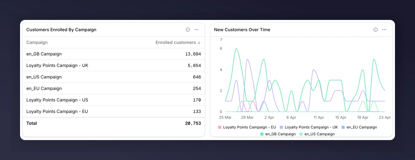 ### 1. Table with key metrics, split by Campaign
1. **Add tile** → **Table**.
2. Add metrics: **New Customers**, **Total Referral Revenue**, **Share Rate**.
3. Set **Breakdown** to **Campaign**.
4. Save.
You get one row per campaign with those three columns.
### 2. Line chart of revenue over time, split by Campaign
1. **Add tile** → **Chart**.
2. Keep chart subtype as **Line**.
3. Add metric: **New Customer Revenue**.
4. Set **Breakdown** to **Campaign**.
5. Save.
This shows the trend per campaign so you can see which ones are accelerating.
## What to look for
* **Outliers in the table**. A campaign with unusually high Share Rate but low New Customers may have strong top-of-funnel but a weak incentive.
* **Crossover in the chart**. A rising campaign overtaking a falling one is usually the most actionable signal.
* **Small campaigns in "Other"**. The long tail collapses into an "Other" bucket. Export the tile's CSV to see the raw rows behind it.
## Next
* [Breakdowns](/knowledge-v2/referral/reporting/building-dashboards/breakdowns) for how top-N and the "Other" bucket work.
* [Comparisons](/knowledge-v2/referral/reporting/building-dashboards/comparisons) to add a vs-last-period number to each campaign (note: requires a second tile per metric, because breakdown and compare are mutually exclusive on one tile).
### 1. Table with key metrics, split by Campaign
1. **Add tile** → **Table**.
2. Add metrics: **New Customers**, **Total Referral Revenue**, **Share Rate**.
3. Set **Breakdown** to **Campaign**.
4. Save.
You get one row per campaign with those three columns.
### 2. Line chart of revenue over time, split by Campaign
1. **Add tile** → **Chart**.
2. Keep chart subtype as **Line**.
3. Add metric: **New Customer Revenue**.
4. Set **Breakdown** to **Campaign**.
5. Save.
This shows the trend per campaign so you can see which ones are accelerating.
## What to look for
* **Outliers in the table**. A campaign with unusually high Share Rate but low New Customers may have strong top-of-funnel but a weak incentive.
* **Crossover in the chart**. A rising campaign overtaking a falling one is usually the most actionable signal.
* **Small campaigns in "Other"**. The long tail collapses into an "Other" bucket. Export the tile's CSV to see the raw rows behind it.
## Next
* [Breakdowns](/knowledge-v2/referral/reporting/building-dashboards/breakdowns) for how top-N and the "Other" bucket work.
* [Comparisons](/knowledge-v2/referral/reporting/building-dashboards/comparisons) to add a vs-last-period number to each campaign (note: requires a second tile per metric, because breakdown and compare are mutually exclusive on one tile).