> ## Documentation Index
> Fetch the complete documentation index at: https://docs.mention-me.com/llms.txt
> Use this file to discover all available pages before exploring further.
# How to Analyse the Funnel
> Find out where you are losing people in the referral flow.
**Question**: "Where are we losing people between seeing the offer and becoming a new customer?"
The referral funnel has five key steps. A funnel chart shows drop-off between them.
## Fastest Path: Funnel Performance Template
The [Funnel Performance template](/knowledge-app/referral/reporting/reference/templates-catalogue) is built exactly for this. Create a dashboard from it and the funnel chart is there, alongside per-stage metrics.
## Build It Yourself
### 1. Add a Funnel Chart
1. **Add tile > Chart**, chart subtype **Funnel**.
2. Add these metrics in order (widest to narrowest):
* Impressions
* Sharers
* Share Responses
* Incented Friends
* New Customers
3. **Save**.
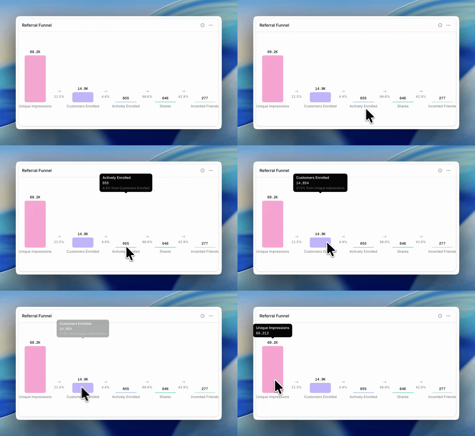
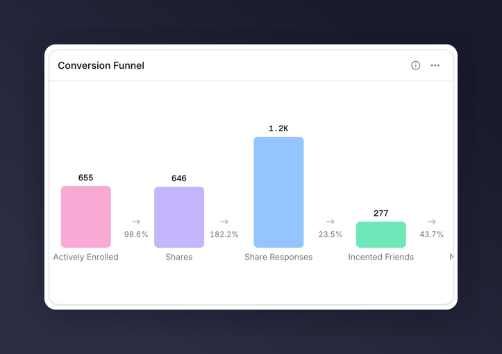 Each bar shows the raw count, and hovering shows the conversion rate from the previous step.
 ### 2. Read the Drop-off
* Impressions → Sharers tells you whether your offer is landing. Under 2% usually points at placement; above 6% means the offer copy is working.
* Sharers → Share Responses tells you about the content of shares and the recipient's interest.
* Share Responses → Incented Friends tells you how well the landing experience converts.
* Incented Friends → New Customers tells you whether the incentive is strong enough to close.
The biggest drop-off is usually the thing worth fixing first.
## When to Reach for a Breakdown
A funnel chart itself doesn't support breakdowns. To see whether drop-off is worse for certain campaigns or markets, add a separate chart or table tile next to the funnel:
* Line chart of **Share Rate** broken down by **Campaign**
* Table of **Share Rate**, **Purchase Rate**, and **Overall Conversion Rate** broken down by **Market**
Where one cell stands out, that's the segment worth drilling into.
## Next
See what each funnel metric counts.
Compare each stage's conversion rate to the industry benchmark (for eligible metrics).
Use once you know which stage is leaking.
### 2. Read the Drop-off
* Impressions → Sharers tells you whether your offer is landing. Under 2% usually points at placement; above 6% means the offer copy is working.
* Sharers → Share Responses tells you about the content of shares and the recipient's interest.
* Share Responses → Incented Friends tells you how well the landing experience converts.
* Incented Friends → New Customers tells you whether the incentive is strong enough to close.
The biggest drop-off is usually the thing worth fixing first.
## When to Reach for a Breakdown
A funnel chart itself doesn't support breakdowns. To see whether drop-off is worse for certain campaigns or markets, add a separate chart or table tile next to the funnel:
* Line chart of **Share Rate** broken down by **Campaign**
* Table of **Share Rate**, **Purchase Rate**, and **Overall Conversion Rate** broken down by **Market**
Where one cell stands out, that's the segment worth drilling into.
## Next
See what each funnel metric counts.
Compare each stage's conversion rate to the industry benchmark (for eligible metrics).
Use once you know which stage is leaking.