> ## Documentation Index
> Fetch the complete documentation index at: https://docs.mention-me.com/llms.txt
> Use this file to discover all available pages before exploring further.
# Choosing a Chart
> Which of the five chart types fits the question you are asking.
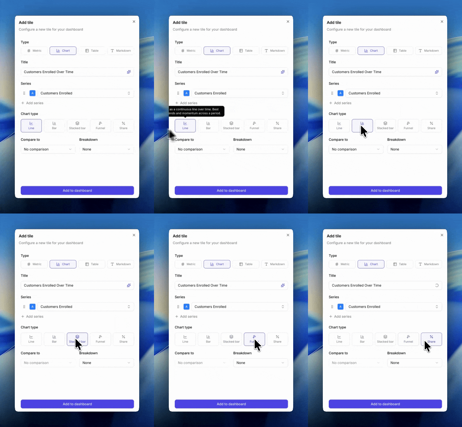
Five chart types are available when you add a chart tile. The right one depends on the question, not the data.
For what each chart does technically, see [chart types](/knowledge-app/referral/reporting/reference/chart-types).
 ## Decision Guide
### "How has this changed over time?"
**Line**. A continuous line plots a smooth trend across the period.
### "How do these periods compare side by side?"
**Bar**. One bar per period makes discrete comparisons easy.
### "How is this total made up, and is that shifting?"
**Stacked bar**. Segments within each bar reveal composition. Typically paired with a breakdown or multiple metrics.
### "Where are we losing people in the funnel?"
**Funnel**. Order metrics from widest to narrowest (e.g. Impressions → Sharers → Share Responses → Incented Friends → New Customers). Each step shows drop-off from the previous.
### "What's the mix or proportion?"
**Share**. A pie-style view of segments. Segments come from a breakdown or from multiple metrics. Use when the total isn't what matters, only the split.
## Three Rules to Remember
1. **Share, funnel, and stacked bar cannot compare.** If you want compare-to, switch to line or bar.
2. **Breakdown and compare-to are mutually exclusive.** Adding a breakdown clears any comparison, and vice versa. If you need both in one view, use two tiles.
3. **All metrics on one chart must share the same unit.** You can't put a currency metric next to a count metric on the same axis.
## Tips
* **Default to line.** It supports breakdowns and comparisons, has no constraints, and works for almost every time-series question. Switch only when you have a specific reason.
* Use funnel for anything sequential where each step is a subset of the previous.
* Reach for stacked bar when the story is "the mix is changing" and for share when the story is "look at the mix right now."
* If you find yourself asking "am I using the right chart", switch it and see. Changing chart type doesn't destroy metric or breakdown choices (as long as the new chart supports them).
## Next
See full technical descriptions of each chart type.
See how splits work.
See the available compare-to options.
## Decision Guide
### "How has this changed over time?"
**Line**. A continuous line plots a smooth trend across the period.
### "How do these periods compare side by side?"
**Bar**. One bar per period makes discrete comparisons easy.
### "How is this total made up, and is that shifting?"
**Stacked bar**. Segments within each bar reveal composition. Typically paired with a breakdown or multiple metrics.
### "Where are we losing people in the funnel?"
**Funnel**. Order metrics from widest to narrowest (e.g. Impressions → Sharers → Share Responses → Incented Friends → New Customers). Each step shows drop-off from the previous.
### "What's the mix or proportion?"
**Share**. A pie-style view of segments. Segments come from a breakdown or from multiple metrics. Use when the total isn't what matters, only the split.
## Three Rules to Remember
1. **Share, funnel, and stacked bar cannot compare.** If you want compare-to, switch to line or bar.
2. **Breakdown and compare-to are mutually exclusive.** Adding a breakdown clears any comparison, and vice versa. If you need both in one view, use two tiles.
3. **All metrics on one chart must share the same unit.** You can't put a currency metric next to a count metric on the same axis.
## Tips
* **Default to line.** It supports breakdowns and comparisons, has no constraints, and works for almost every time-series question. Switch only when you have a specific reason.
* Use funnel for anything sequential where each step is a subset of the previous.
* Reach for stacked bar when the story is "the mix is changing" and for share when the story is "look at the mix right now."
* If you find yourself asking "am I using the right chart", switch it and see. Changing chart type doesn't destroy metric or breakdown choices (as long as the new chart supports them).
## Next
See full technical descriptions of each chart type.
See how splits work.
See the available compare-to options.